Feature Analysis
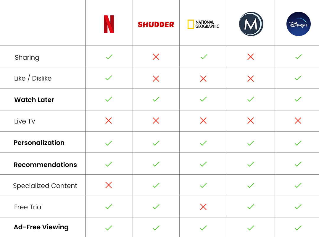
To kick off the design process, I analyzed features from seven competing streaming services and identified the strengths and weaknesses of the three most relevant ones.
Most streaming services had recommendations, personalization, ad-free viewing, and a watch later option.
Problem Discovery
With the help of existing reviews of the History Channel app, I was able to identify some of the main pain points among users.
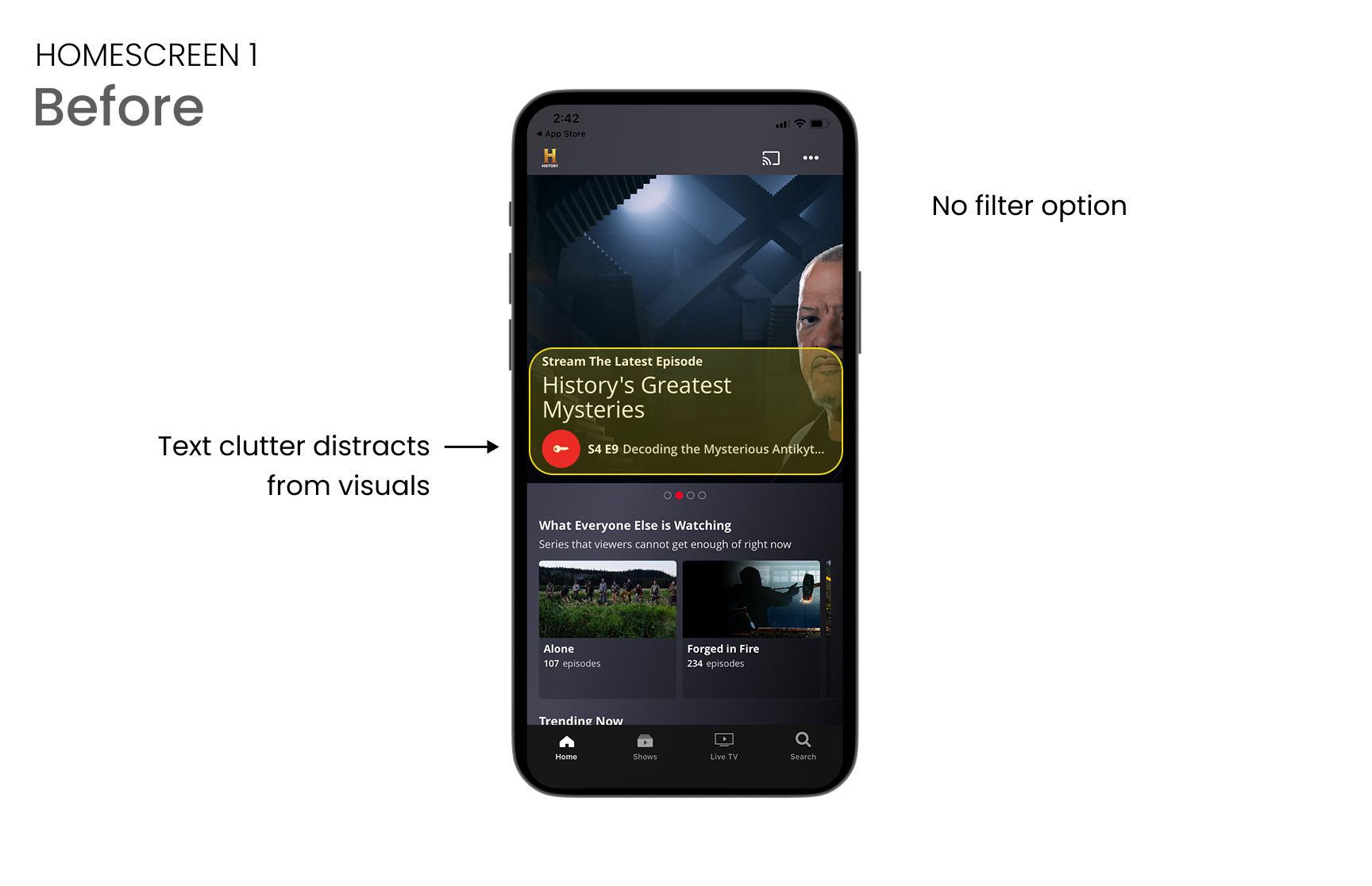
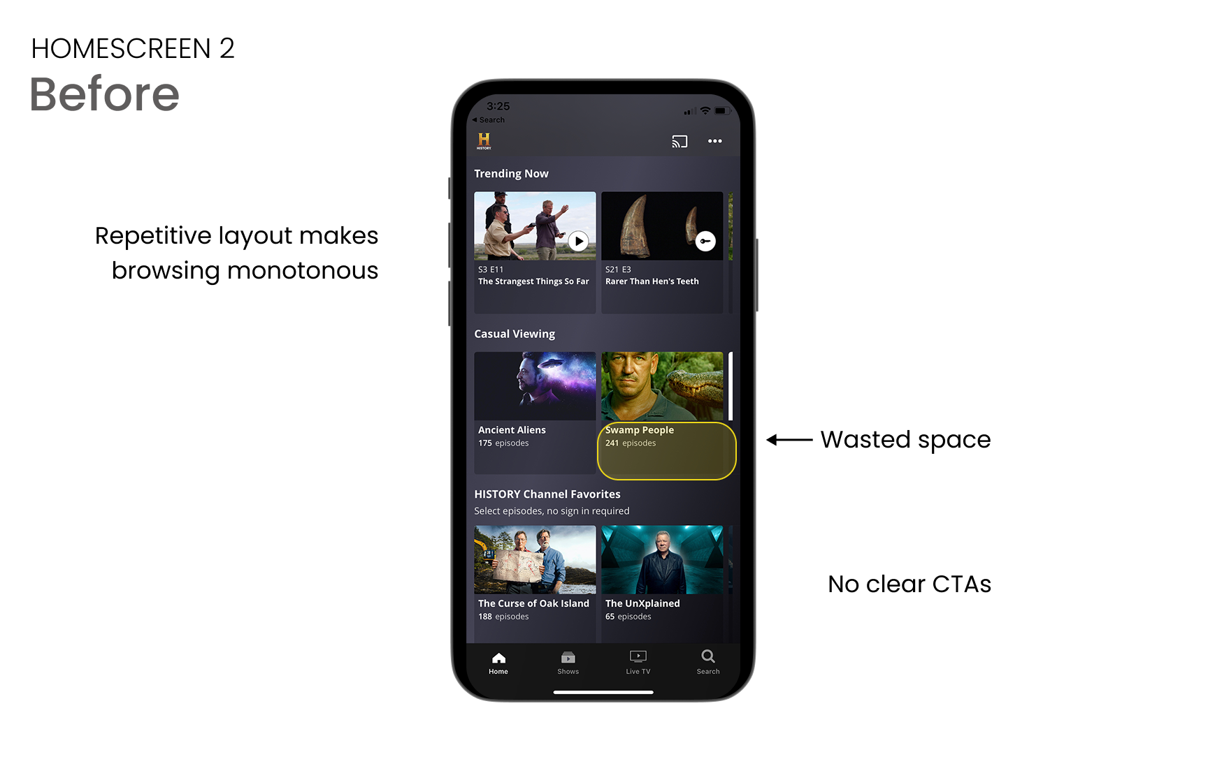
Main frustrations included too many ads, users couldn't keep track of episodes, and that they couldn't differentiate between genres.
I feel like I'm watching more ads than content, even with a subscription.
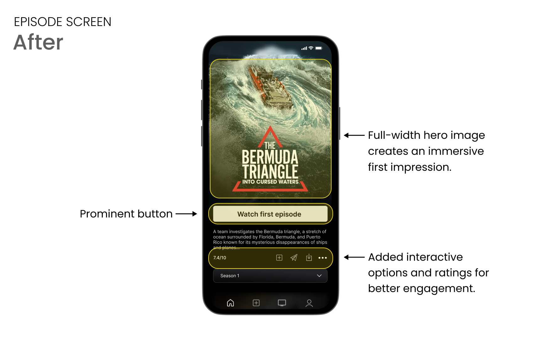
Every time I watch an episode it kicks me out and doesn’t resume to the next episode.
I don't have a tv subscription
I haven’t subscribed to a cable provider since 2009. This is why I don’t watch History Channel shows until they end up on some other streaming service.
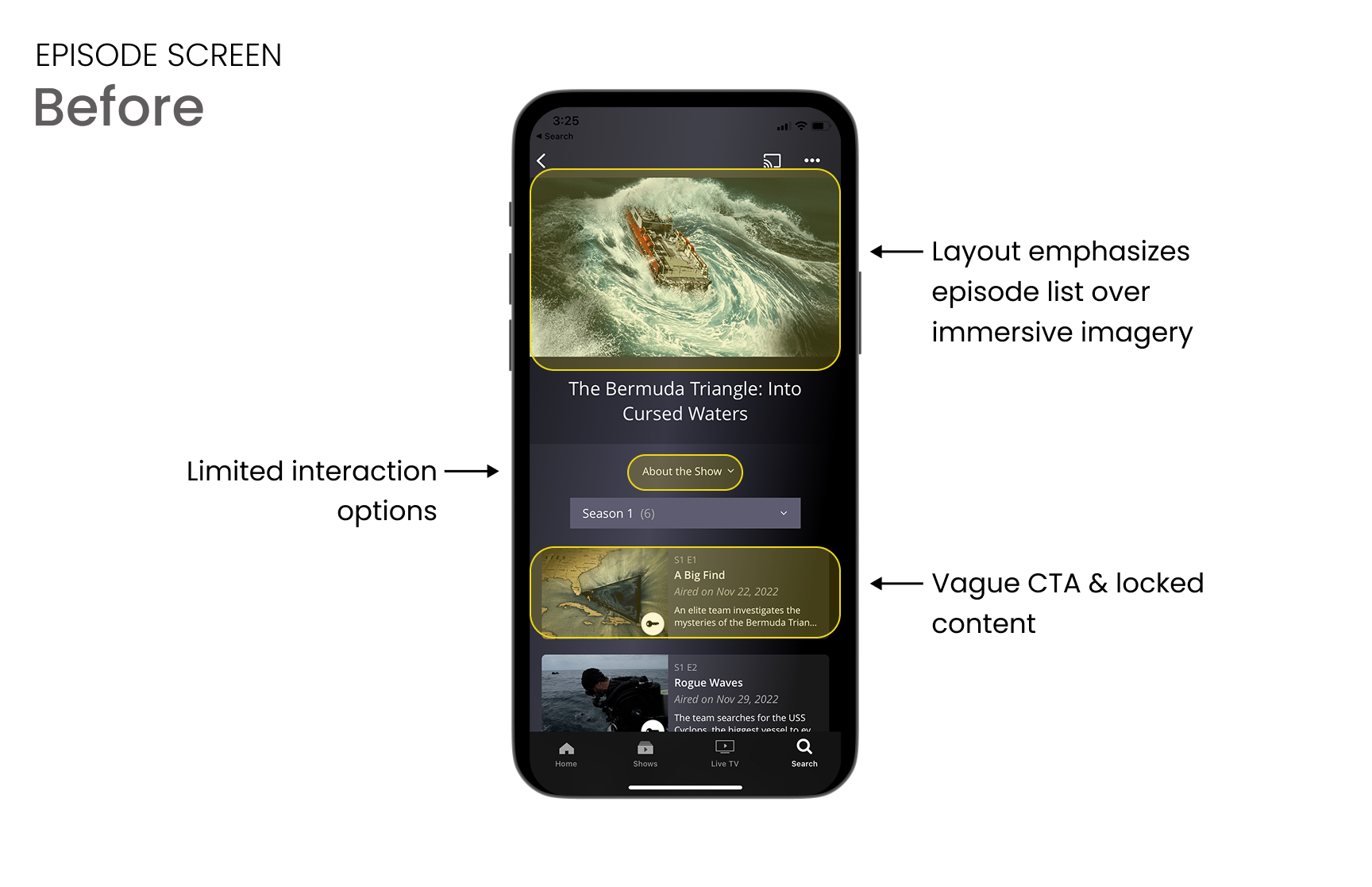
I have to work harder than I’d expect to find what I want to watch in this app.
It’s hard to identify programs that are actually historical. I’d like to see some factual documentaries rather than reality TV
The app does not keep track of where you last were watching, constantly hopping between seasons or episodes within a season. This means having to search around to find the right episode.
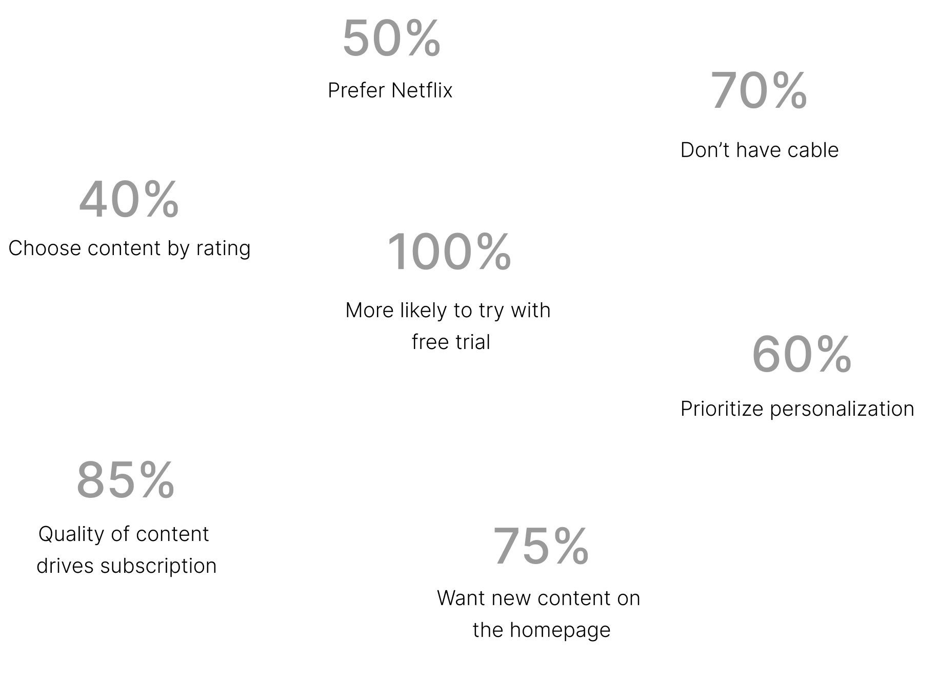
Surveys
Through conducting surveys, I aimed to discover:
What appeals to a broad audience when it comes to streaming services?
Which streaming services are most popular and why?
What motivates users to invest in a streaming service?
Personas
Each persona highlighted distinct user needs that informed design decisions. By grounding my redesign in these personas, I would be able to ensure the app would address the diverse motivations and challenges of its audience.

BILL
the returning user
Long-time fan of the History Channel and huge history buff. He is not very tech-savvy and finds it challenging to remember how to use new interfaces.

EVORA
the new user
Enjoys watching historical programming. She values accurate information and wants to learn more about the past.
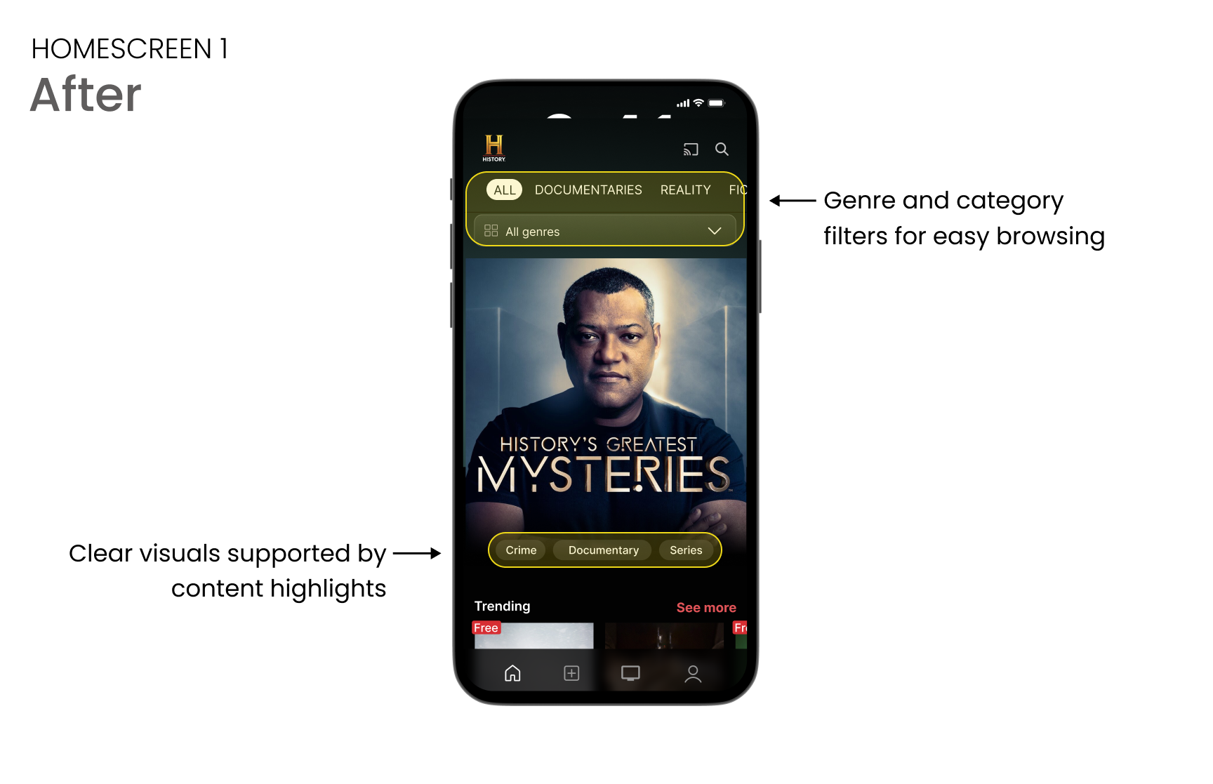
Thoroughly categorized content
A way to filter reality TV from documentaries
Ability to share with friends and family
Streaming that doesn't require cable
User Flows
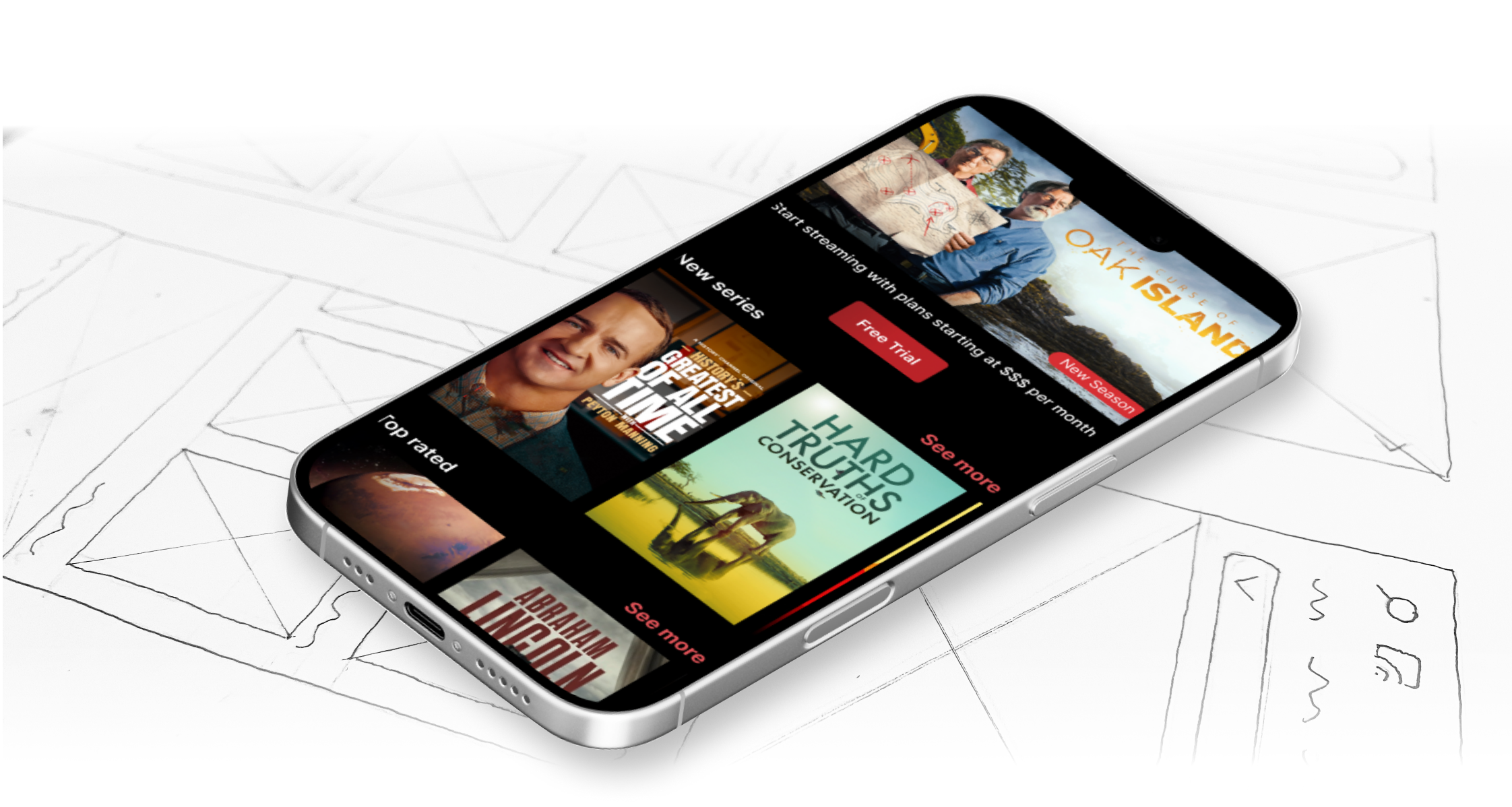
With the flows and prototypes in mind, I created a fully functioning mid-fidelity prototype based on tasks I speculated would fulfill the goals, needs, and wants of both the business and the personas.


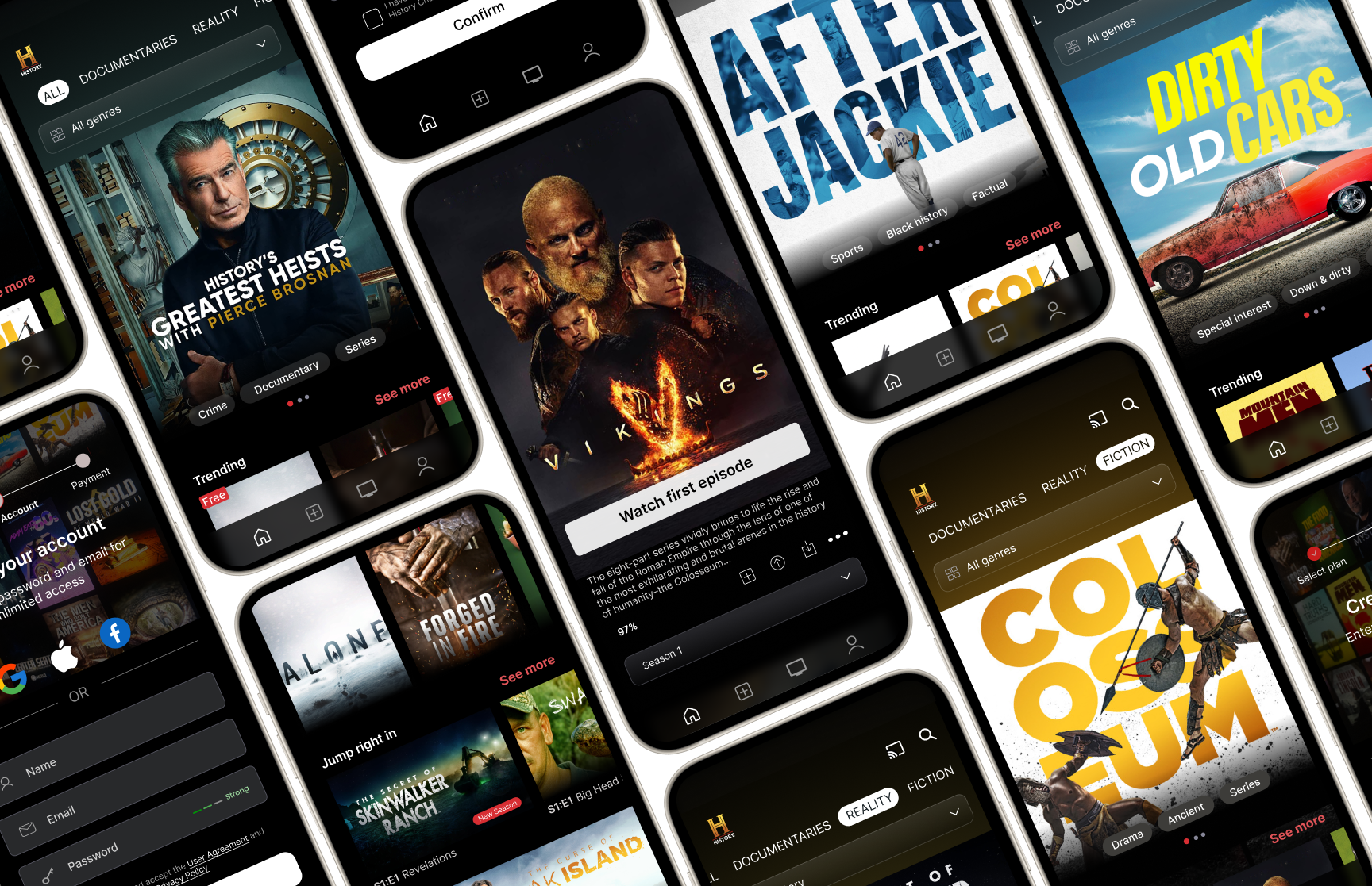
Prototype
I had a lot of fun with this project because my love for history gave me a shared goal with the History Channel, to make history more accessible. Reading so many reviews from frustrated users pushed me to dig deep into their content on imdb, sort it, categorize it, and make sure the best shows were front and center.
This project taught me the value of design to help people connect with the product and content in a way that feels effortless and rewarding.