Surveys
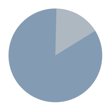
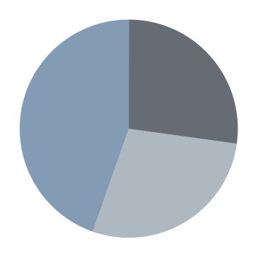
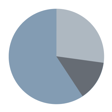
To kick off the discovery phase, I conducted a survey to understand users’ frustrations, preferences, and needs, uncover opportunities, and inform persona development.
Is it difficult for you to find a mentor?
What is your preferred method of networking?
How do you prefer to learn new information?
Interviews
Based on a series of interviews about competing apps and experiences with mentors, I organized the results into insights and painpoints.
“I use Career Karma, it’s a great way to network”
“I trust people when I can see their work history and organizations they are connected to”
“I trust people with similar backgrounds as me”
“It’s helpful when my mentor and I have the same time zone”
“I have gotten all of my previous job offers from networking”
“I like word-of-mouth because it’s basically an informal review system”
“It’s awkward finding a mentor on linkedin. I don’t like having to initiate with people I don’t know”
“I don’t like Linkedin because it is too saturated and there’s too much competition”
“Networking on apps and websites isn’t organic enough”
“I feel like me and my mentor just didn’t click”
“Clients tend to cancel when there aren’t any repercussions”
“Meeting people online is intimidating”
Personas

BILL
the returning user
Long-time fan of the History Channel and huge history buff. He is not very tech-savvy and finds it challenging to remember how to use new interfaces.

EVORA
the new user
Enjoys watching historical programming. She values accurate information and wants to learn more about the past.
Thoroughly categorized content
A way to filter reality TV from documentaries
Ability to share with friends and family
Streaming that doesn't require cable
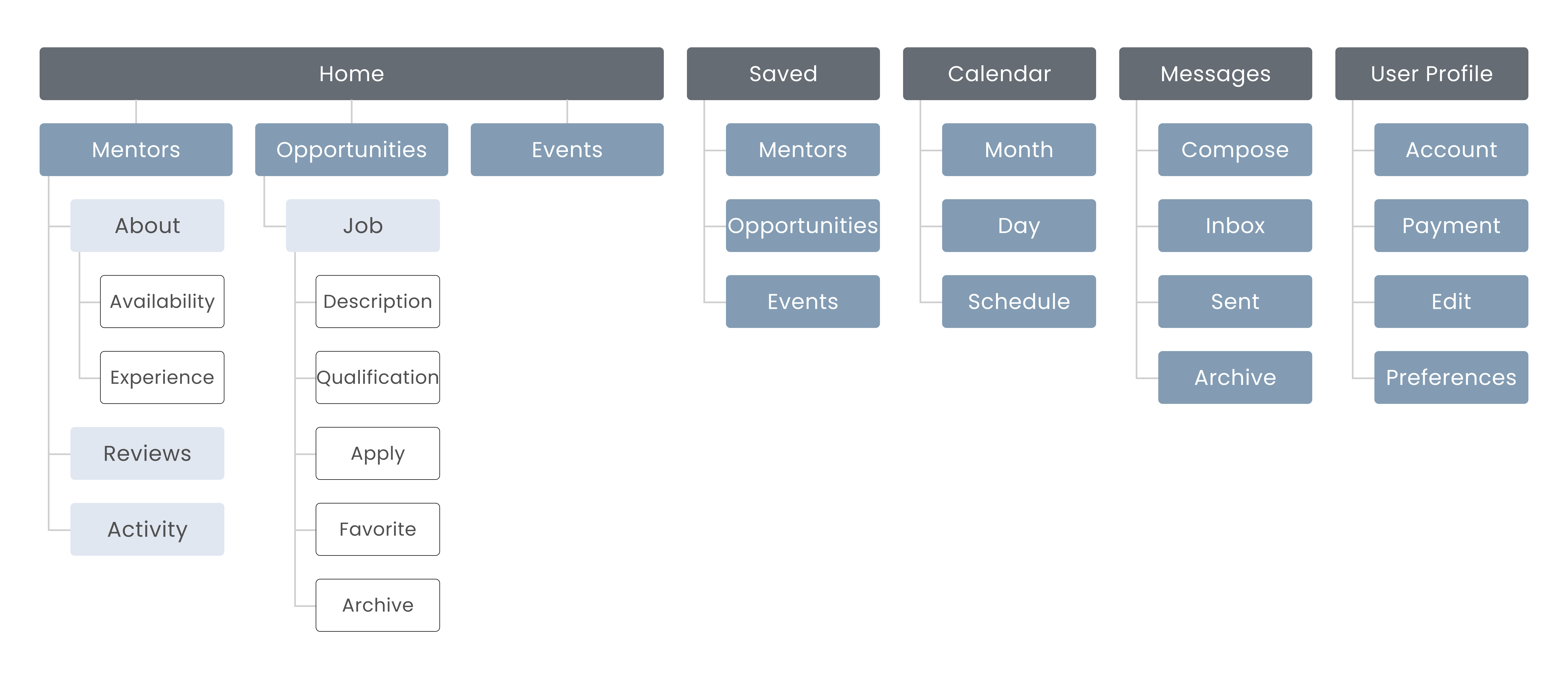
Sitemap
I aimed to balance consistency with creative flexibility to keep posts varied but visually aligned. I also wanted to remain loyal to the established brand identity, which was a coastal-modern aesthetic characterized by:

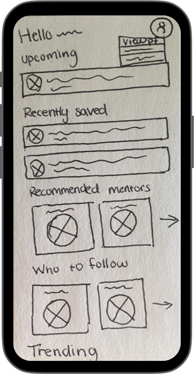
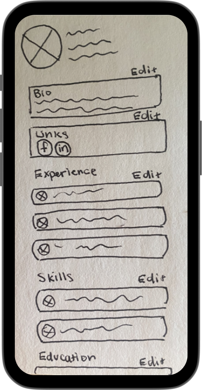
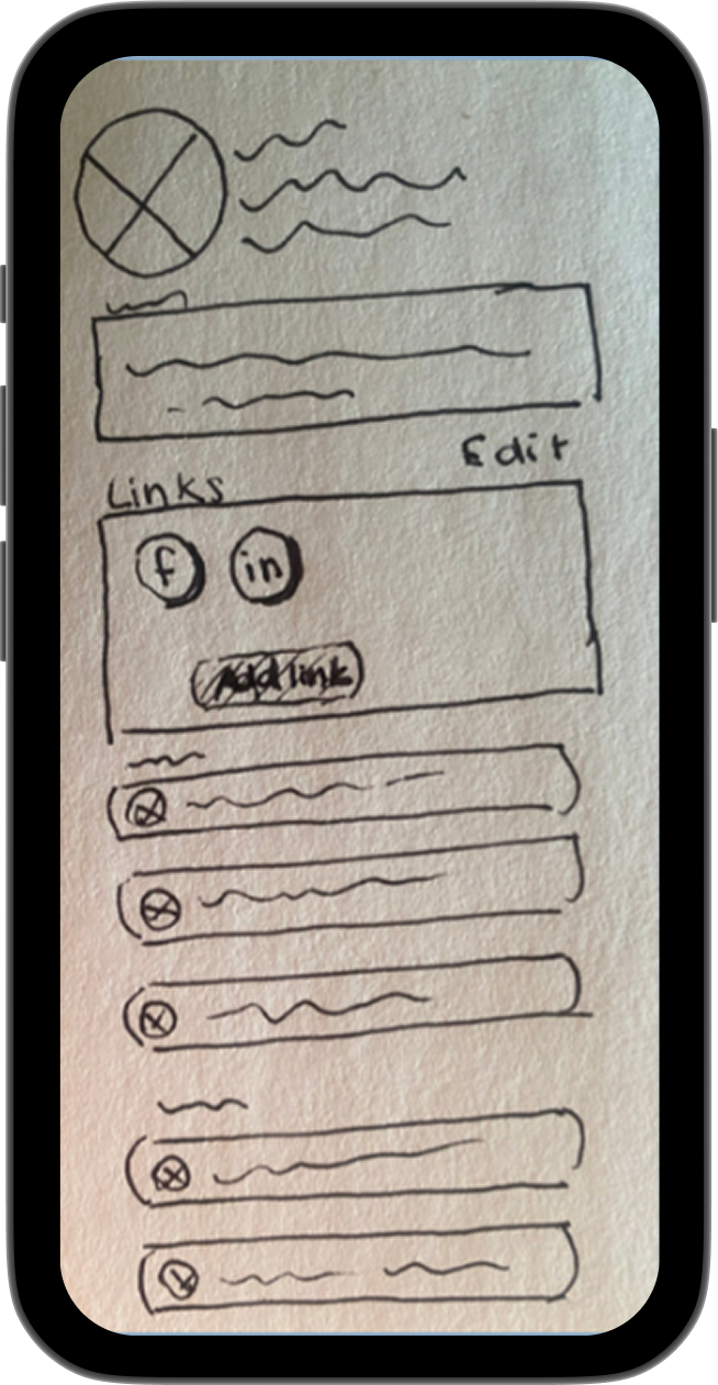
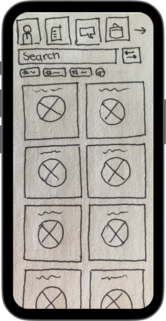
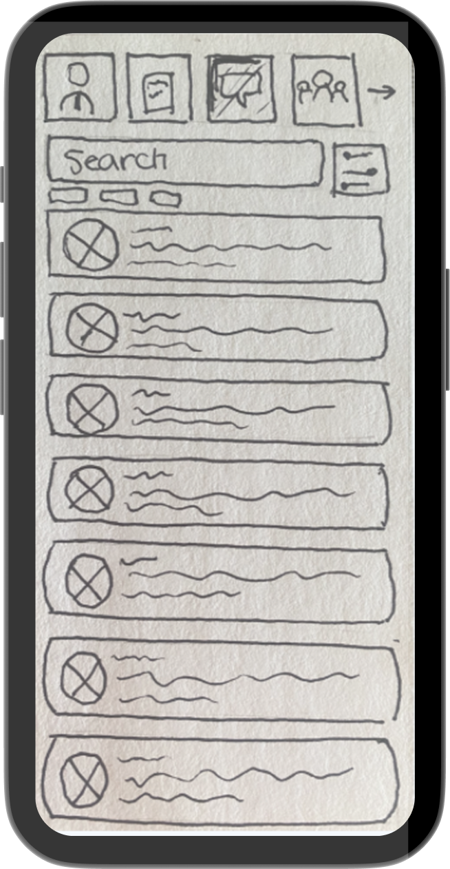
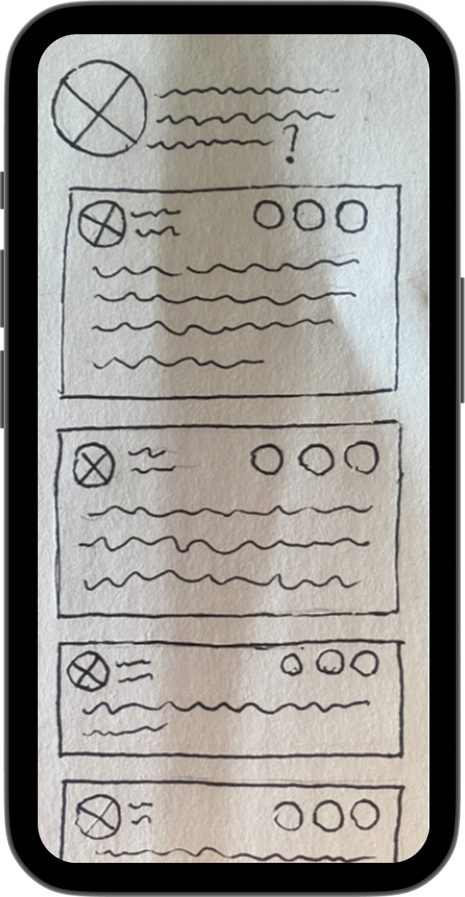
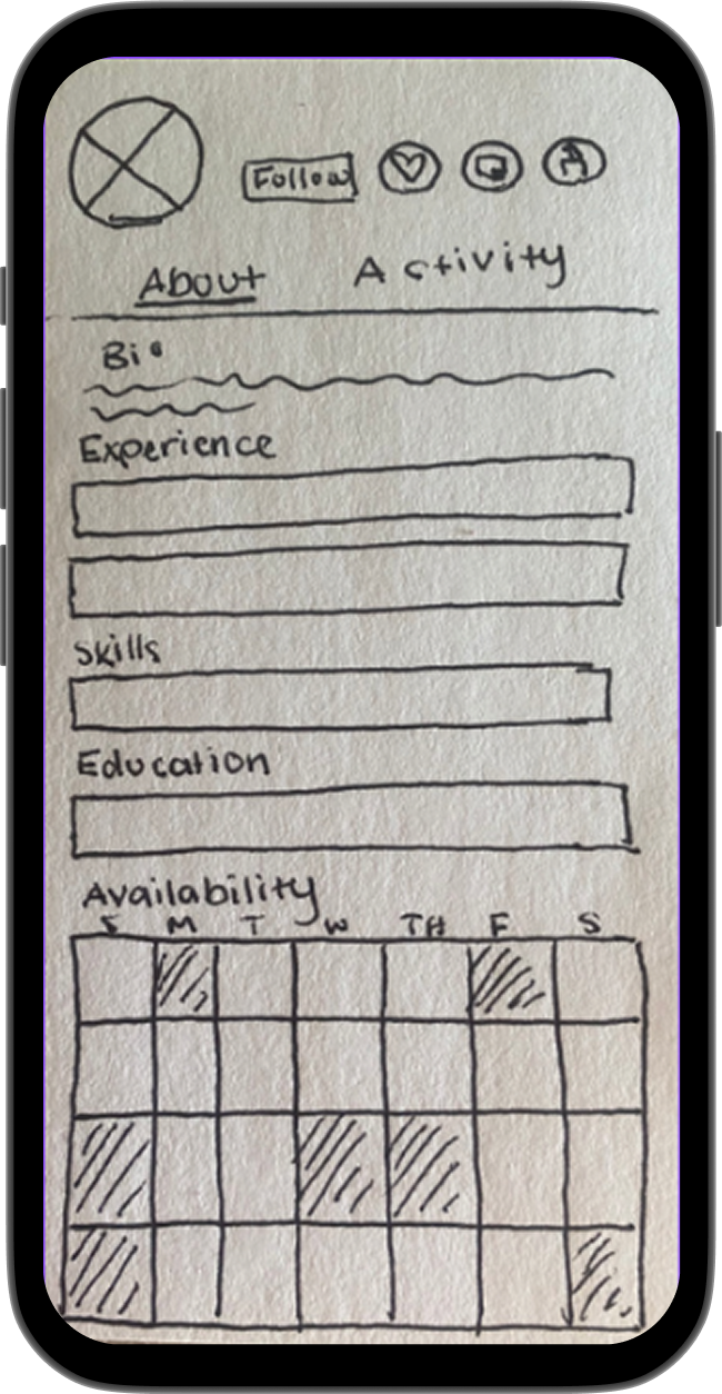
Low-Fidelity Wireframes
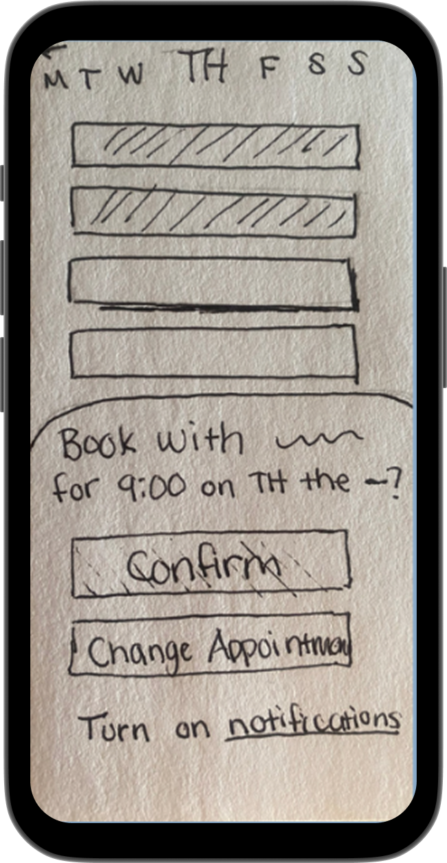
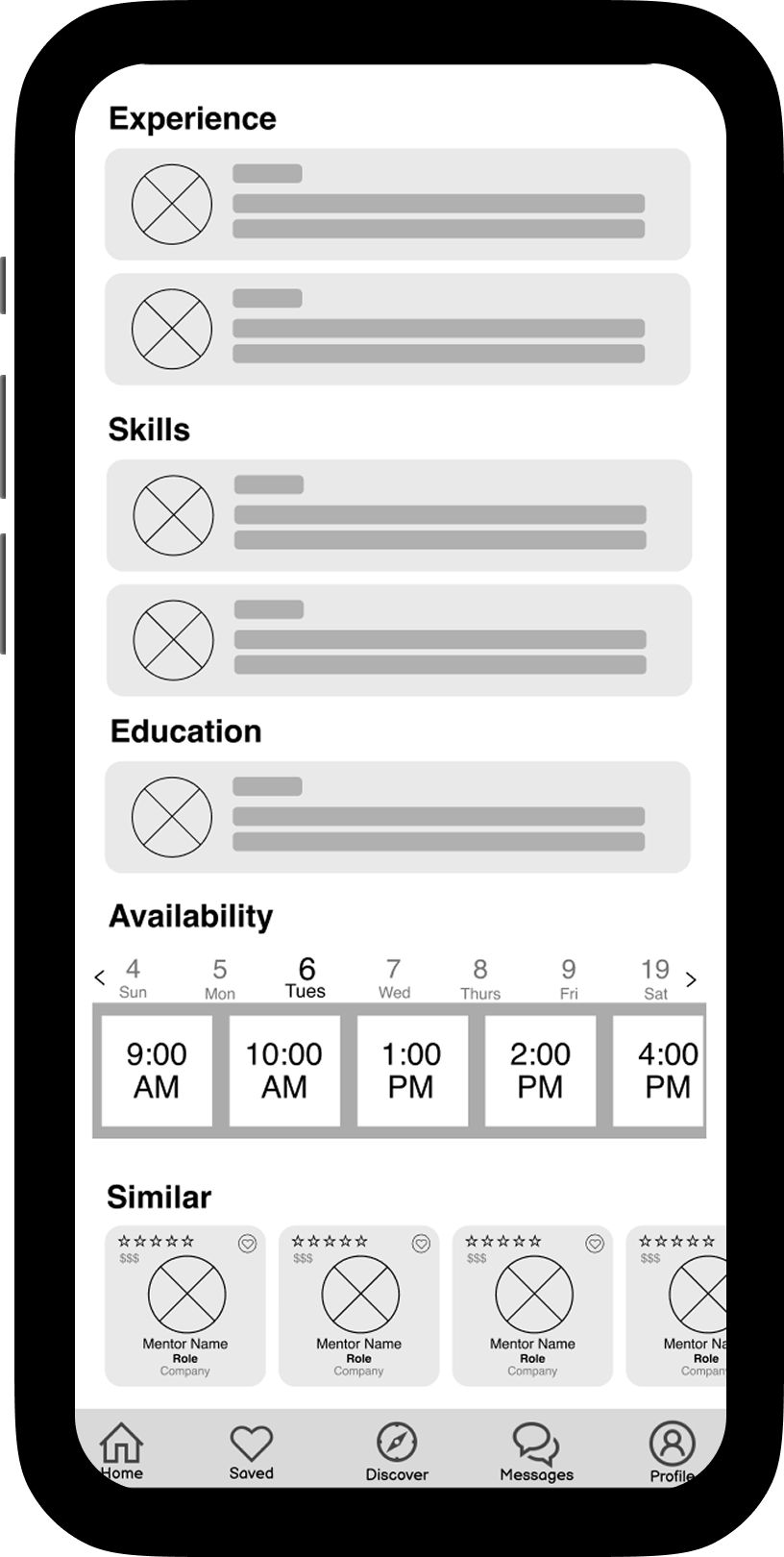
The next part of my design process was creating a layout of the app's main pages. With pen and paper, I designed a handful of wireframes.
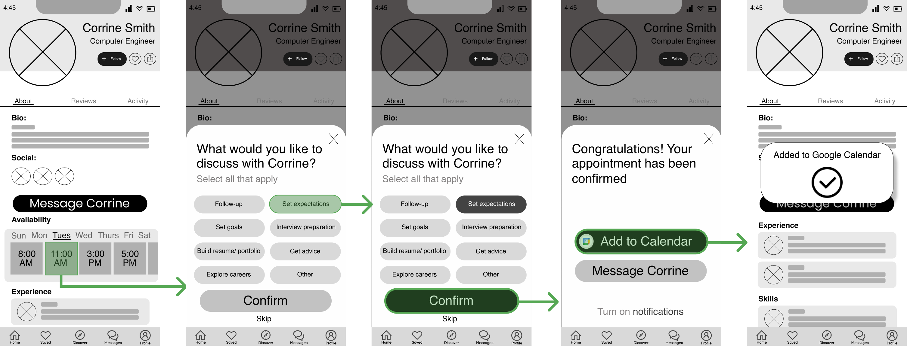
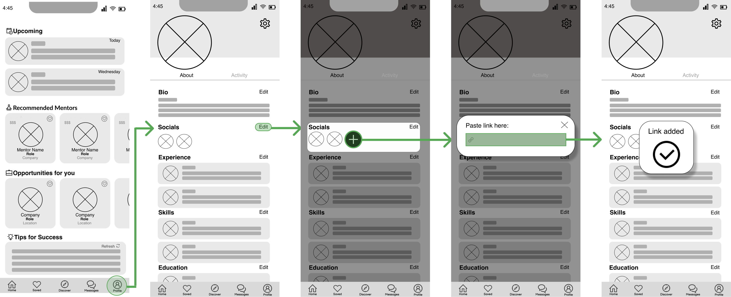
Flows & Mid-Fidelity Wireframes


Usability Testing
The next step of my process was to conduct usability tests. By observing participants complete a series of tasks, I was able to identify strengths and points of friction.
The following are the most severe issues that testers faced and the solution to those issues.
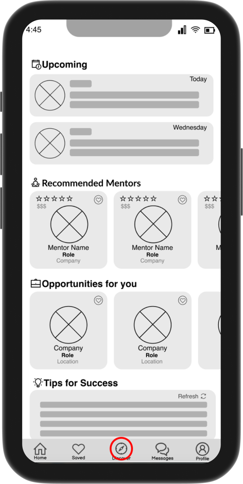
Participants struggled to locate the discussion post.
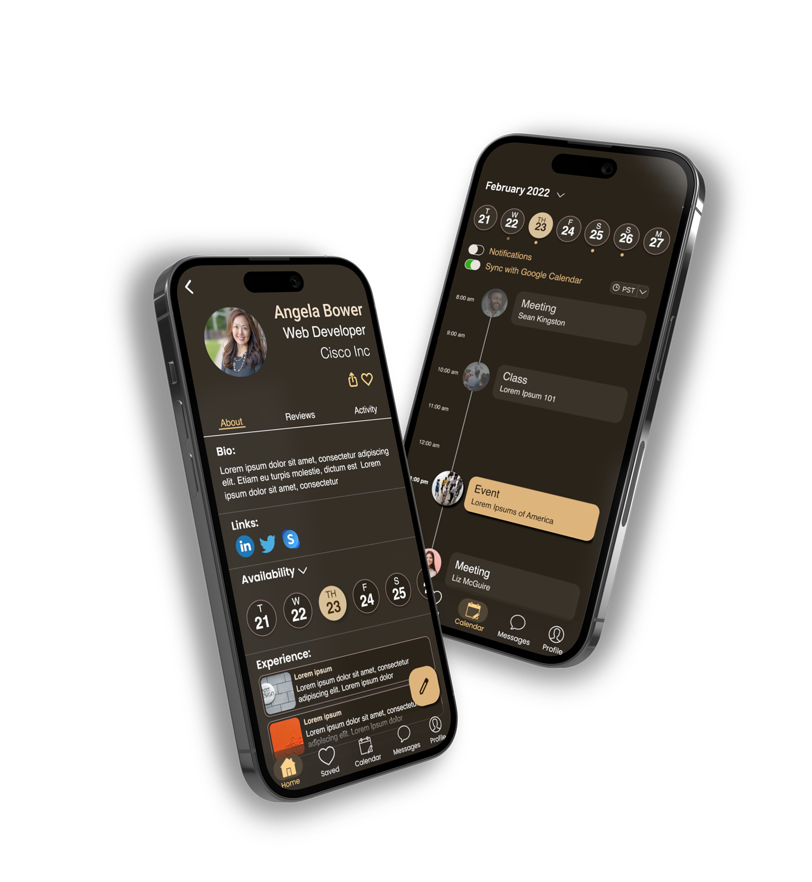
Rather than having a dashboard, the discover page became the welcome screen, since the main function of the app is to "discover" mentors and opportunities. This removed an unnecessary step for the user.
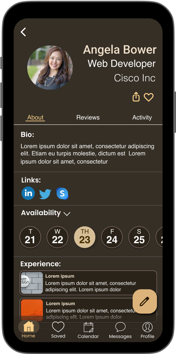
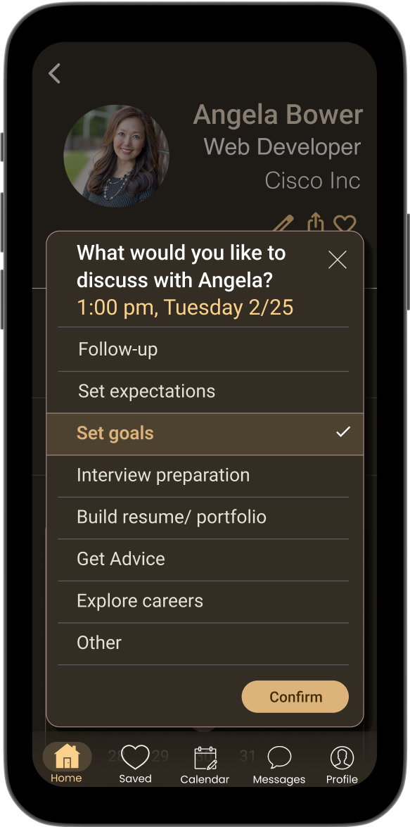
Participants had difficulty finding the appointment setting feature on the mentor page, and when they did, they could not figure out how to set an appointment.
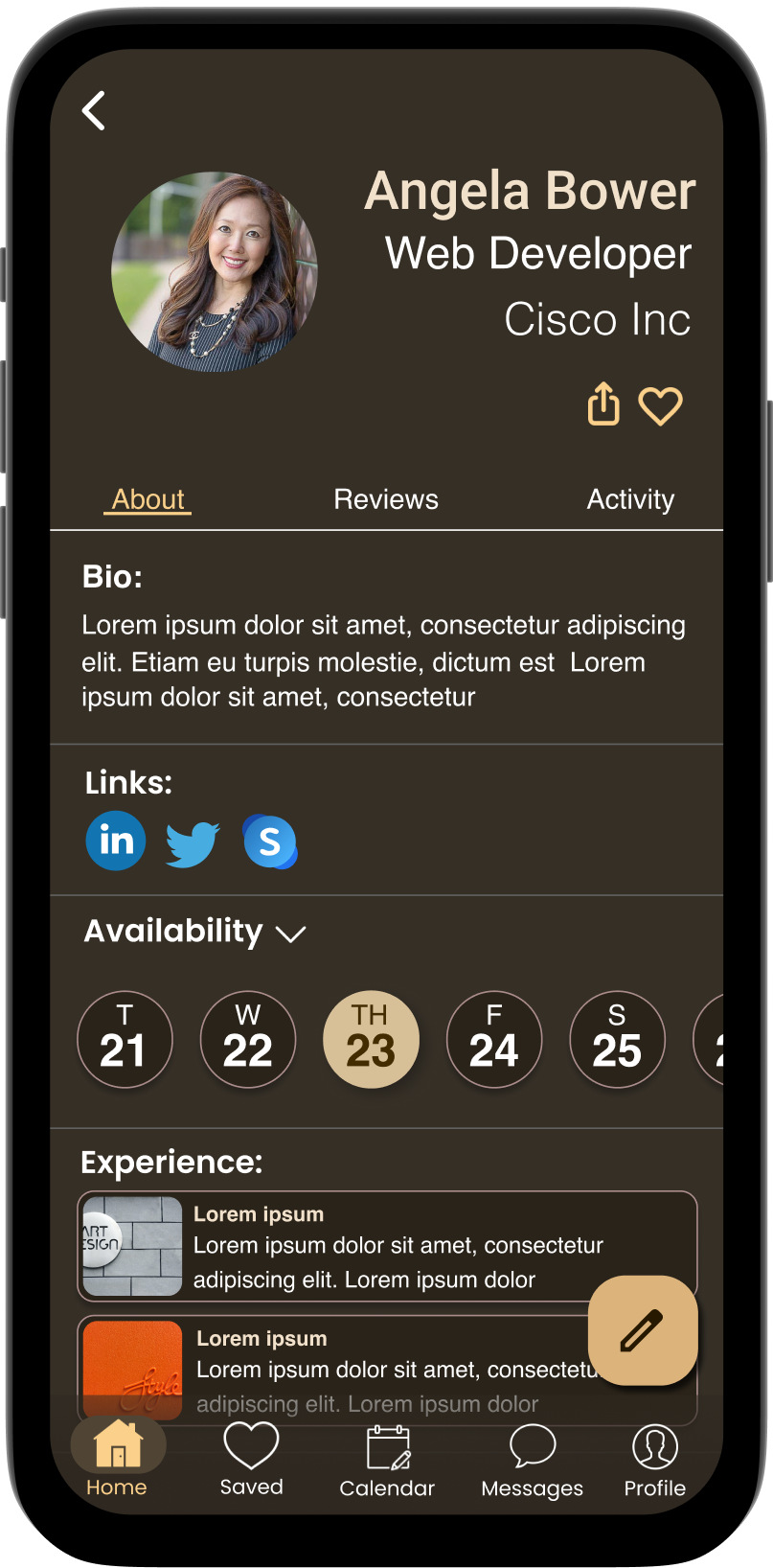
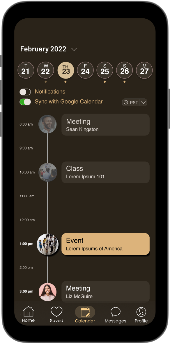
Move availability to the top of the mentor page. Create a calendar feature where users can view all of their appointments. Create a more thorough scheduling system.
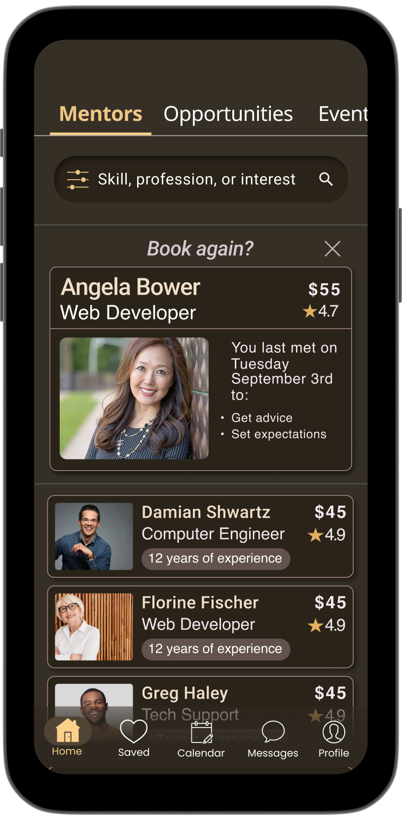
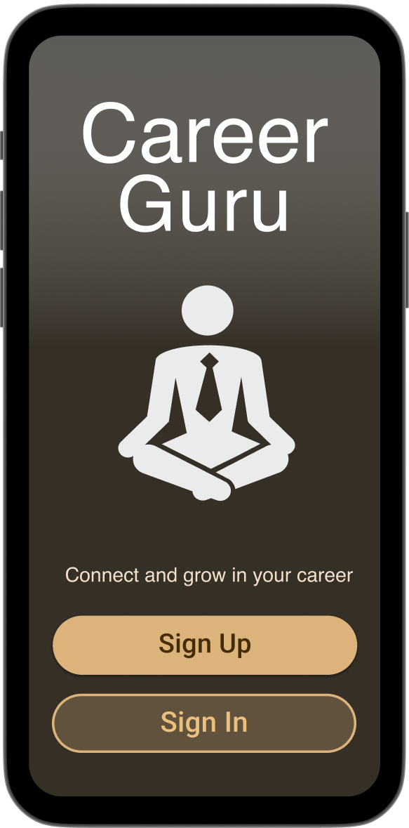
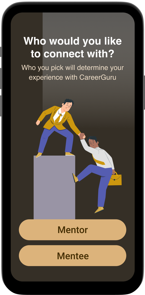
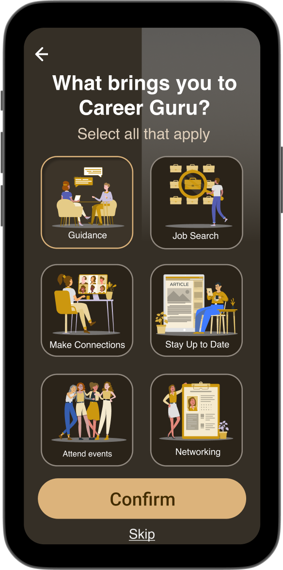
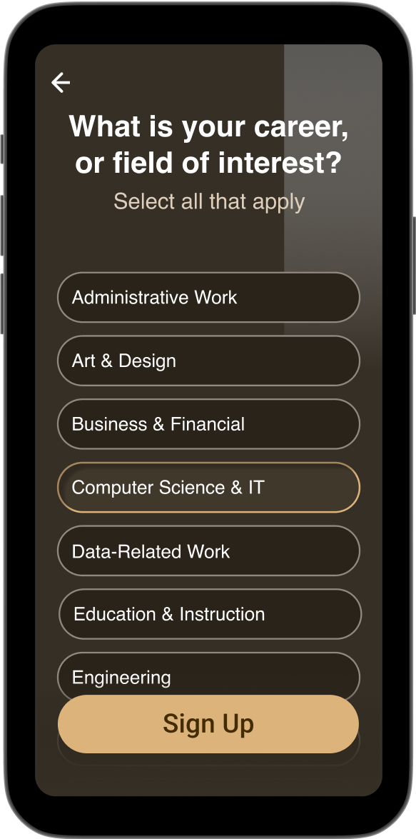
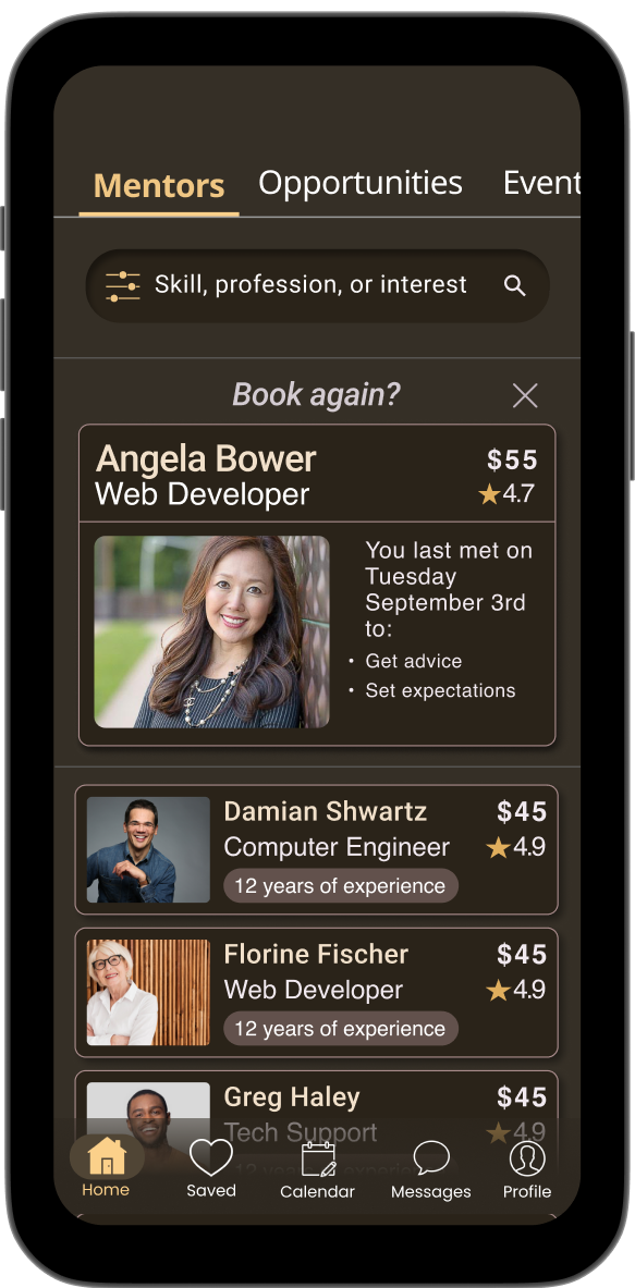
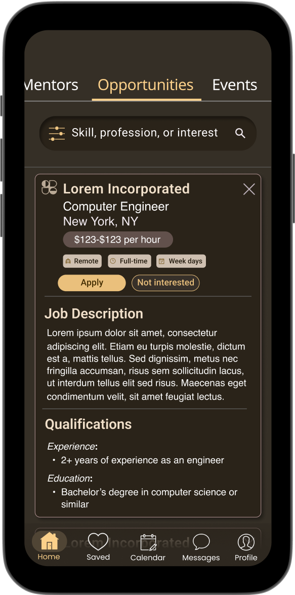
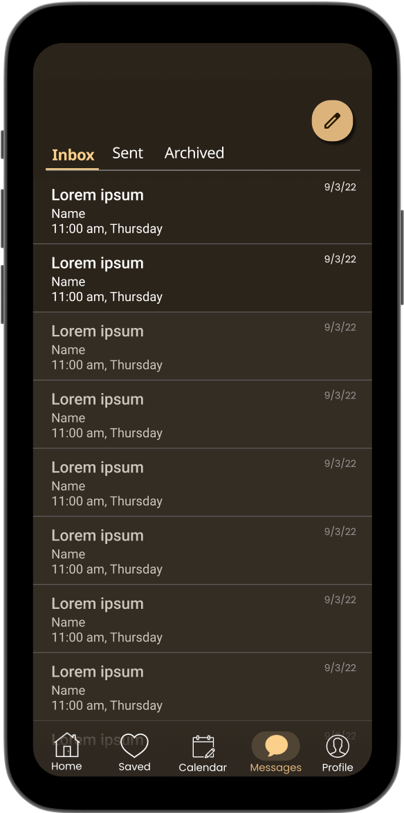
After testing, I brainstormed a UI that conveyed calmness and elegance, using a dark interface for professionalism and a yellow primary color to evoke excitement. To maintain clarity, I avoided crowded pages, used bright fonts for contrast, and limited images to profile pictures, events, and articles.
Colors

Typography
For consistency, I decided to use the font Roboto for every size and usage
After sharing my design, I received constructive feedback and refined the layout by improving contrast, adding borders, and increasing whitespace to enhance accessibility. This iteration resulted in a final Career Guru design that balances functionality with visual appeal.

